Awhile ago, I designed a logo for an app/computer game/animation called Banana Bandits. The racoon was drawn by Echo Bridge Pictures LLC, and the type was drawn by yours truly.
Thursday, December 27, 2012
Wednesday, September 12, 2012
I Presented a New Brand Today
My newest (and very exciting) client is a natural health company called "Living the Good Life Naturally". When meeting with the owner, after I was hired on, we discussed all that she wished to have from me as a designer. I became extremely excited when she said she needed a new logo, and just an entire new look. This has been a fantastic project to take on. I love taking a company and turning it into something visual and tangible. Something people can see, not just talk about.
I presented my design today with her. She was SO nervous and worried to see it. This made the experience even more sweet when she saw what I came up with, and really liked it. Sighs of relief and smiles of excitement. She said "You nailed it." Huge compliments. Some things do need to be tweaked, but so far, we are on a great path!
Here is the Logo I came up with. The company name is quite long, which made it difficult to create a concise word mark, but I came up with something I feel works great, and the client is very happy with it as well.
The faded logo on the left is the one logo I had been going with, but then came up with a better solution that is in full view. Just the smallest tweaks to a logo can make a huge difference. "God is in the details" ~Bob Winward (love that guy.)
Now that we had the logo set in place, we could start running. I needed to come up with a graphic element(s) we could use to beautify and really nail in the brand. My client said "If I see one more leaf, tree, or branch, I will puke." (or something to that effect!) This forced me to do some major research. What on earth symbolizes natural health that isn't a leaf or a tree?? After a lot of research and thinking, I thought. "Bare essentials. This company is all about the bare essentials, natural healing...CELLS." Cells is what I ran with. I was inspired from some beautiful artwork I discovered as I was researching more on cells, and brainstorming ideas of how I could me a cell beautiful. This is what I came up with... (just a sneak peak of the website heading... I can't reveal that until it is live. I know, the anticipation is killing you! She absolutely loves what I've come up with, and I think you will be pleased as well. Just hold your horses for a few weeks)
She absolutely LOVED this. I was thrilled, and she was thrilled. Not only are they cells (and not leaves lol) but the colors of that of the different chakras and energies, there were so many things she loved about it. Grins from ear to ear.
I decided to have fun with this presentation, I really love my client. We get along great, laugh a lot, and I knew she had a good sense of humor. So before I even showed her the logo concepts (after I shared them the mission statement I developed for them), I said "We want to get excited about this new brand. People are going to be excited to support this company, much like this guy right here..." Then I showed them this image....:
This was a FANTASTIC ice breaker. She was extremely nervous. This helped tip toe into my presentation, and get her relaxed because this picture is pretty hilarious. After I showed them the logos, and they decided upon the one I showed you, I then said "This is great, now that we have this going, anyone can proudly support and show off your company, from business men, to babies..."
"...To the entire world."
This last one got them laughing pretty good. My goal was to get her to laugh and enjoy the branding process. She was so so anxious and nervous due to bad previous experience. I wanted to let her know she can enjoy it, and she can have restored faith in the power of her brand.
I've got a lot of work ahead of me for this client, and I'm thrilled.
The faded logo on the left is the one logo I had been going with, but then came up with a better solution that is in full view. Just the smallest tweaks to a logo can make a huge difference. "God is in the details" ~Bob Winward (love that guy.)
Now that we had the logo set in place, we could start running. I needed to come up with a graphic element(s) we could use to beautify and really nail in the brand. My client said "If I see one more leaf, tree, or branch, I will puke." (or something to that effect!) This forced me to do some major research. What on earth symbolizes natural health that isn't a leaf or a tree?? After a lot of research and thinking, I thought. "Bare essentials. This company is all about the bare essentials, natural healing...CELLS." Cells is what I ran with. I was inspired from some beautiful artwork I discovered as I was researching more on cells, and brainstorming ideas of how I could me a cell beautiful. This is what I came up with... (just a sneak peak of the website heading... I can't reveal that until it is live. I know, the anticipation is killing you! She absolutely loves what I've come up with, and I think you will be pleased as well. Just hold your horses for a few weeks)
I decided to have fun with this presentation, I really love my client. We get along great, laugh a lot, and I knew she had a good sense of humor. So before I even showed her the logo concepts (after I shared them the mission statement I developed for them), I said "We want to get excited about this new brand. People are going to be excited to support this company, much like this guy right here..." Then I showed them this image....:
This was a FANTASTIC ice breaker. She was extremely nervous. This helped tip toe into my presentation, and get her relaxed because this picture is pretty hilarious. After I showed them the logos, and they decided upon the one I showed you, I then said "This is great, now that we have this going, anyone can proudly support and show off your company, from business men, to babies..."
Thursday, August 23, 2012
Waldo Lee, Can I Work for You?
OH my goodness. I randomly came across some of this guy's work. And I love it! Waldo Lee. Go to walee.com to see his (pretty sure it's a design firm with the work I've seen) so to see their work. Love his ideas. How does he execute these so well?
Waldo Lee, can I please work for you? Pretty pretty please with a cherry on top?
Clever. Anyone could think up this idea, but to execute it so well is serious bad ass skill.
Love this idea! Treat yourself to mouth watering design/photography/illustration goodness and go to his website! walee.com
Waldo Lee, can I please work for you? Pretty pretty please with a cherry on top?
Love this idea! Treat yourself to mouth watering design/photography/illustration goodness and go to his website! walee.com
I'm Faced with a Dead Brand Issue.
Working at KSM Music, I have tried to improve their advertising and branding. This is VERY hard to do, because the owner is extremely set in his ways. My dream would be to re-create his entire brand. Logo and everything. They have no direction right now, no rhyme or reason to the way they advertise. They are a tough company to design for, because the boss is very particular about things, and very stuck to...15 years ago.
I have a big dream to present an entire re-brand development to him. But before I do, I need to get everything prepared, so he can see it. And then tell him, and prove to him why this will improve his business. KSM Music is hanging by a thread constantly, and part of it is how we are perceived! OK, a huge part of it. So many customers that have been KSM customers for a long time mention that KSM Music hasn't ever changed. Kevin loves that it hasn't changed, because he wants to drive home "brand recognition." But if a brand is dead, and we are still driving home a dead brand... It is bad news bears. I am intimidated by my boss, he is very loud, and like I said, set in his ways. This would take a LOT of preparation, but if I can find time to devote to his business, I would love to present it to him. Because I'm afraid KSM Music is running out of time before they have to close the doors and surrender to our online competition and competition in Ogden and Salt Lake.
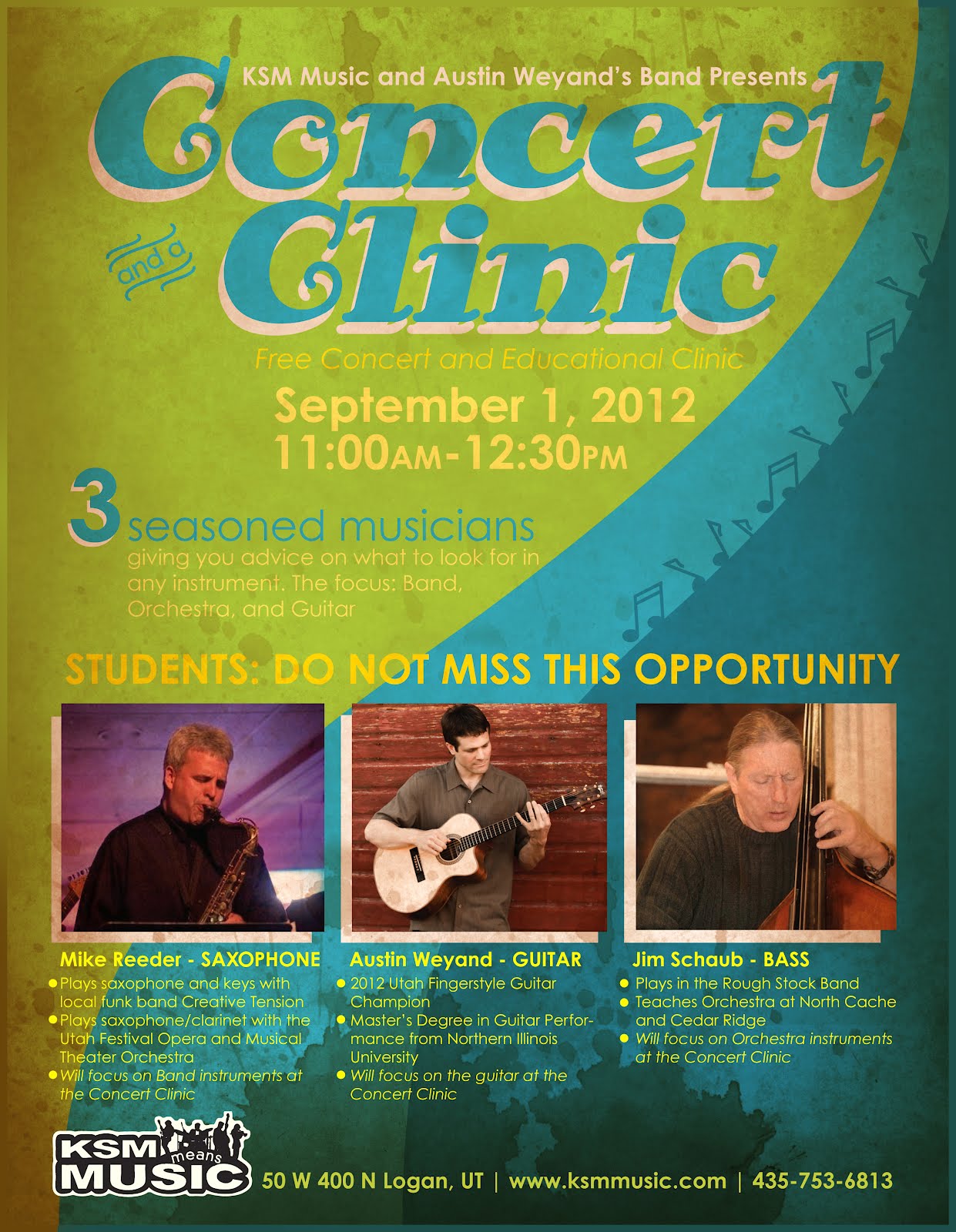
This is a flier I created yesterday for a Concert Clinic we are putting on. It's so much different than anything has put together for KSM Music. I'm interested to see the reaction of students while I hand these out to different schools. If they act a bit more impressed, and feel like KSM is more professional. Normally, someone throws together a little word doc with a couple pictures inserted, and of course the KSM Logo (that is terrible...I just have to say.)
Just note, that KSM Music is still only paying me the sales rep wage to do their design work. They don't have much money to spare, so this is going to pretty much be volunteer work if I'm able to find the time to research and prepare a branding brief with my boss. I love KSM Music, and my boss is such a hard worker and a great guy. I want to help them as much as I am able to. I worry though, that I put in hours and hours of work, and get pumped to show him and fight for a new branding direction, and for him to be extremely defensive and shut it entirely down. But I won't know unless I try, right? The worst that could happen, is I have something else to put in my portfolio, and just take a little pride hit if he says no.
I just picked up a HUGE client, that I am stoked about! So my time is mostly devoted to that business, but as I'm working on other freelance work, I can probably start researching music marketing and begin the filtering phase.
Branding is too much fun. Now only if we could add a few more hours in our days! Hehe
I have a big dream to present an entire re-brand development to him. But before I do, I need to get everything prepared, so he can see it. And then tell him, and prove to him why this will improve his business. KSM Music is hanging by a thread constantly, and part of it is how we are perceived! OK, a huge part of it. So many customers that have been KSM customers for a long time mention that KSM Music hasn't ever changed. Kevin loves that it hasn't changed, because he wants to drive home "brand recognition." But if a brand is dead, and we are still driving home a dead brand... It is bad news bears. I am intimidated by my boss, he is very loud, and like I said, set in his ways. This would take a LOT of preparation, but if I can find time to devote to his business, I would love to present it to him. Because I'm afraid KSM Music is running out of time before they have to close the doors and surrender to our online competition and competition in Ogden and Salt Lake.
This is a flier I created yesterday for a Concert Clinic we are putting on. It's so much different than anything has put together for KSM Music. I'm interested to see the reaction of students while I hand these out to different schools. If they act a bit more impressed, and feel like KSM is more professional. Normally, someone throws together a little word doc with a couple pictures inserted, and of course the KSM Logo (that is terrible...I just have to say.)
Just note, that KSM Music is still only paying me the sales rep wage to do their design work. They don't have much money to spare, so this is going to pretty much be volunteer work if I'm able to find the time to research and prepare a branding brief with my boss. I love KSM Music, and my boss is such a hard worker and a great guy. I want to help them as much as I am able to. I worry though, that I put in hours and hours of work, and get pumped to show him and fight for a new branding direction, and for him to be extremely defensive and shut it entirely down. But I won't know unless I try, right? The worst that could happen, is I have something else to put in my portfolio, and just take a little pride hit if he says no.
I just picked up a HUGE client, that I am stoked about! So my time is mostly devoted to that business, but as I'm working on other freelance work, I can probably start researching music marketing and begin the filtering phase.
Branding is too much fun. Now only if we could add a few more hours in our days! Hehe
Wednesday, August 22, 2012
Personal Brand Inspiration
Some great personal marks of identity. Good inspiration. Click here to view more from the website I found these on!
My Re-Brand has Begun.
I've been re-thinking my branding strategy for my personal brand. My current one looks something like:
But this doesn't really nail my design work. It's a good logo for me in my personal life, but not me as a designer. So, I have began reverting back to the logo I designed awhile ago. I never designed it to use, but the more I look at it, the more I've decided I would like to implement it and use it as the core of my design brand identity. It looks something like this:
The basis of my design philosophy is: Simple, quick to recognize, memorable, bold, clean, smart. I'll be posting as I go through the new stages of my re-branding project and let you know how it goes!
What logo do you like better for a graphic designer? Any critique of these logos? I'll take any feedback!
Tuesday, March 6, 2012
Article of the Week: The New Typographer Muttering in your Ear

I read an article today called "The New Typographer Muttering in your Ear" by Kevin Fenton. It was an interesting read on his view of the twenty-first centuries use of typography and I'd love to share it! Sorry if the text seems slow moving, but just read it. It's good :)
"Every published word is filtered through the sensibility of a typographer or a designer acting as a typographer. Writers have a great deal to lose or gain from the choices thus made." He, as a writer, talks about how passionate yet humble he feels about typography, not being educated in design but having a love for words. He then talks about the book "Typography 15" by Dirk Rowntree. In this book, he quotes they praised design that: "participates in the meaningful dialect of deconstructionism, challenges the way we read -- thereby subverting messages and creating alternative readings of a text, and ensuring that the usual hierarchy of text and design is subverted by its message."
He then asks the question... "what was wrong with the traditional hierarchy? What are typographers subverting and why?... Subversion without a discernable purpose seems little more than vandalism."
But then he explains that he believes it is more a reaction to staleness, a return to expression...
..
.....
........
..........
AN INSERTION OF GHOSTS INTO THE MACHINE.
..........
........
.....
..
By introducing emotion and irony, the new type corrects a tradition of soullessness." The article goes on, and then ends: "Some of the new work is beautiful; much of it is fun; a fraction of it may be profound. As a writer, I am disturbed by the penchant of contemporary typographers for inserting yet more self-expression into an already narcissistic society and for creating confusion in a world which already seems sufficiently confused. I believe that, if it is skillfully used, the new type has the power to introduces us to new feelings, new interpretations, new shades and shadows of thought. But, at the very least, type shouldn't make us any more stupid than we already are."
After reading this, I felt inspired to work harder on my typography skills, and understanding what is appropriate and when. He states that the known is less intrusive than the new, that typography may be more interpretive than creative, and that the typographer can overinterpret and suffocate type.
This article was controversial to me as a designer. When dealing with type, we are dealing with a writer, and the need for clarity of the message. If the words just ask for more visual substance to further it's message, than I say go for it and see what fun you can have with the type. But we don't need to over design when there is no need.
Sunday, March 13, 2011
Bubbly Fish
Here's a demo we did in my Graphic Interface class. We were to make a fish that blew bubbles when you moved it around. Go ahead and try it out!
Sunday, February 27, 2011
Two More Spreads
Tuesday, February 22, 2011
Strings to Her Soul
For Type and Visual Imagery, we are creating a catalogue on..... ourselves! Not gonna lie, I was a bit freaked out getting this assignment. I mean, how am I supposed to make a catalogue of me? Can my life really be thrown into a book? I almost feel guilty, like this is a giant, glorified shrine I'm designing... of myself. LOL. But, I have had some fun with it, and am excited to see the outcome. Here's a spread I'm working on. It's not finished but I need to move on and get more things done before I spend more hours on this.
I'm liking this direction with type used. It's not done but the look and feel is feeling better:

First go, all hand written:

This spread is dedicated to music, with random words I think and feel when I play the guitar.
I'm liking this direction with type used. It's not done but the look and feel is feeling better:

First go, all hand written:

This spread is dedicated to music, with random words I think and feel when I play the guitar.
Getting Back into Digital Drawing
For Graphic Interface, we are creating a flash game. Quick timed 5 min sketch of something totally random. This kid isn't part of my game, but trying to get my brain flowing and more comfortable with digital drawing again. It's been awhile. Since I haven't posted for awhile, may as well post a doodle :)
Friday, January 21, 2011
Finest Little Cigar Made
My mom gave me this awesome, old cigar box from my Grandma. She doesn't know the history of it, but we think it was one of my Grandma's Father's cigar boxes. I'm dying to know the history of it, I'll have to find out.
I am SO excited to have this! Vintage graphic design, this box is one of those things that reassures me I'm in the right field if I'm drooling when I look at it :)


I am SO excited to have this! Vintage graphic design, this box is one of those things that reassures me I'm in the right field if I'm drooling when I look at it :)


New painting: "Hope in Uncertainty"
This last weekend I heard of an art sale going on at USU. So I ran to the store, bought some canvases, and painted and painted and painted away! 3 days later, we set it up, and put it for sale the following day. End result: it didn't sale. But I did it, and I'm pretty happy about that.
Title: "Hope in Uncertainty"


Title: "Hope in Uncertainty"


Tuesday, January 11, 2011
History of ID and Architecture: Recap
This class caught me completely off guard. Turned out to be my favorite art history class, and a real inspiring one. Our professor was very animated and passionate about the class, which makes a WORLD of difference. We learned from the beginning of architecture, back to Egypt where pharoahs ruled, tombs filled with extravagant gold and precious stones and memorabilia and furniture. The first shelves discovered in Skara Bra, Scotland. On to Greece, and Rome and their sculpture, their philosophy, their politics and religious beliefs and how that effected the furniture they filled their rooms with. The Roman Triumphant Arch, symbolism. How this branched from Italy to France, then to England. The movement of Architecture and how much of what we see today stems back to ancient Greece. Queen anne funiture, Chippendale. It was so interesting to see how much Religion and Politics effected the movement of furniture, interior design, and architecture. Pushing extremes from everything for God, to everything for the law and rulers (eg. King Henry VIII) and how it's bounced back and forth depending on who was in charge. Who would have thought politics and religion were the major factors in the course of Interior Design and Architecture?
We sketched a total of 40 sketches, in pen, of furniture, art, or architecture we discussed. Here's a bunch thrown together to show a bit of what we did.

Class rating: *****
We sketched a total of 40 sketches, in pen, of furniture, art, or architecture we discussed. Here's a bunch thrown together to show a bit of what we did.

Class rating: *****
Thursday, December 30, 2010
Happy Holidays!
Hope the Holidays found you all well! I know mine did. Lots of food, family, friends, singing, painting, sleeping, all that good stuff!
My sisters were creative this year and made a lot of their gifts for their kids. Tawnya crocheted toys, made pajamas, even crocheted me a cowl. Rachelle and Sean made a giant barbie doll house, sewed up some nightgowns for their girls. I'm constantly surrounded my creative people...and I love it. I had Lane for Christmas. He recently moved to Indiana for Dental School, and has been begging me to paint a picture for his house! And since I had him this year for Christmas, I figured I may as well paint his present!

God bless, and Happy Holidays!
My sisters were creative this year and made a lot of their gifts for their kids. Tawnya crocheted toys, made pajamas, even crocheted me a cowl. Rachelle and Sean made a giant barbie doll house, sewed up some nightgowns for their girls. I'm constantly surrounded my creative people...and I love it. I had Lane for Christmas. He recently moved to Indiana for Dental School, and has been begging me to paint a picture for his house! And since I had him this year for Christmas, I figured I may as well paint his present!

God bless, and Happy Holidays!
End of Semester: Painting Recap
Turned into a hectic semester! Accomplished quite a bit. Picked up an internship that consumed MUCH more of my time than expected. Made a few posters, programs, and other things for music events. Really loved that opportunity. My Brand Identity class had a huge project to brand Downtown Logan City: our client was the head of the Downtown Alliance. Our group did an amazing job, I'm really proud of the outcome. Painting class was great, learned a lot and now really want to paint more! Here's some pics...
Painting 1:cluster of paintings

Favorite: Shoes

My other favorite was the 2nd palette knife painting. It was supposed to be a self portrait. Mine looked like a man, so I went with it. Then my professor said it looked like a dead corpse you might see at that "Body World" exhibit! Lol. It was fitting, being done around Halloween.

Turns out, I love to paint. I'll be doing more in the future :)
Painting 1:cluster of paintings

Favorite: Shoes

My other favorite was the 2nd palette knife painting. It was supposed to be a self portrait. Mine looked like a man, so I went with it. Then my professor said it looked like a dead corpse you might see at that "Body World" exhibit! Lol. It was fitting, being done around Halloween.

Turns out, I love to paint. I'll be doing more in the future :)
Wednesday, December 29, 2010
Brand Identity Final Project: the MFA
Brand Identity Final Project: The MFA
Recap: Rebrand Downtown Logan.
We gave a 10 minute presentation, including a preface to our project and proposal, a video illustrating our proposal, and question and answer time. I'm really proud of our group. We even pulled an all-nighter at the school, working on this til 6 in the morning. Hard work but it all paid off. During our presentation, we handed this 'swag' to the judges:


Here's a really horrible copy of the video. Figured it was better than nothing. (turn down your speakers...) I don't have the original file, so I recorded it from a burned DVD playing on my laptop LOL. It's a school project, not a professional video. Awfully time consuming but that's just how it is in the creative world! :) It really sweet at 1:53. SO happy with how that turned out.
Recap: Rebrand Downtown Logan.
We gave a 10 minute presentation, including a preface to our project and proposal, a video illustrating our proposal, and question and answer time. I'm really proud of our group. We even pulled an all-nighter at the school, working on this til 6 in the morning. Hard work but it all paid off. During our presentation, we handed this 'swag' to the judges:


Here's a really horrible copy of the video. Figured it was better than nothing. (turn down your speakers...) I don't have the original file, so I recorded it from a burned DVD playing on my laptop LOL. It's a school project, not a professional video. Awfully time consuming but that's just how it is in the creative world! :) It really sweet at 1:53. SO happy with how that turned out.
Friday, October 22, 2010
Painting
A couple paintings from class. We've done about 6 paintings now, I'll post them later :)
The painting on the left was to be predominantly cool colors. The painting on the right was to show a passage from warm colors to cool colors. They need finished, but our professor wants us to bust out lots of paintings without worrying too much about the details. Just get used to mixing color and throw it together on a canvas, basically.
Subscribe to:
Posts (Atom)