Saturday, September 25, 2010

The Dreaded Figure Grounnnnnd...

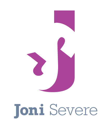
So, before I start explaining this project, I need to rewind and tell you why I dreaded this assignment so much. Like I said, I'm taking Brand Identity for the second time. My most hated project of the entire semester (even year!), was the Figure-Ground project. What was this assignment? A big pile of crap, that's what it was. Oh, you mean, what were we supposed to design? Simple: a figure-ground relationship with your initials. Just throw two letters together, move them around a little, and voila, you should have it! But no, like many projects we (all artists) take on, it was much more involved. I labored day after day, fighting with this thing. The final product was turned in, I was given a pity grade, and into the trash it went. Even after the project was done, I tried to fix it, but decided I was simply given the wrong initials. It was my parents fault. HAHA, ok not really, but I decided I didn't need to stress about it so much, and just move on.

Needless to say, we were assigned this same project my second round in the class. Be open minded, try it out, don't even look at your last attempts. After some good self-pep talk, I went for it. And only a few hours later, fully focused and determined to redeem myself, I found my solution. When I turned the 'S' just so, with that font, and looked at what had just presented itself, I could barely hold in my excitement! This is gonna be good... And it's about freakin time Joni! So now that I have given you more than enough info on this process, without further 'ado, my initials in a figure-ground relationship:


...critique: The class hates me. HAHA not really (although they said it! :P). It just means they liked my work. It's a good thing :) My professor only had one thing to suggest: kerning on my signature line. But the logo itself worked really well. -- I've fixed the kerning, and changed the colors in this image.

This project taught me a lot, and gave me a boost in my design skills. I think the biggest lesson I learned from this project is that with Graphic Design, an open mind is key to being successful. I compare all that was happening in my life when I first attempted this project, also the class. I was not focused on school, had several life-stressers that I just couldn't get my mind off of, but was still expected to create original, creative, really good ideas. Now I do a lot of things to relieve stress, like exercise, play guitar, and not set such crazy, unrealistic expectations. I've found that lifting all that pressure off has helped me deal with all of life's little stresses much better, and has actually improved my design sense.

Wednesday, September 22, 2010

Back at it!

Well, I'm back in school full-fledged this semester, and it feels good to finally be designing again! I'm taking 4 classes: Painting 1, Intro to Computer Science (nerd alert! 8) ), History of architecture and Interior design, and Brand Identity. Yes, Brand Identity, for the second time. Why would I be taking it again, you ask? To strengthen my portfolio is what it boils down to. I haven't been designing for the last six months or so, but am now able to re-focus and get my portfolio going again! It needs a lot of work, and I'm excited to see how it turns out.

Our first assignments...

Painting

Black and white self-portrait, referencing a mirror, with oil paint. It has been about five years since I've even touched oils, or paint in general, and i now wish I hadn't taken that big of a break from it. I absolutely love this class. It's a time for me to relax, throw color around, get my hands dirty, and paint however I want. There's a lot of freedom in painting, and a feeling of connection with the canvas. Sometimes, working on the computer all day with Graphic Design, it's impossible to feel the intimate experience that you get with "traditional art" (by this I mean NO electronics, just a brush/pen/charcoal/etc, and a blank piece of old-fashioned paper/canvas.) Here's the first painting:


...critique: The painting feels more like an emotion, than a real life depiction. It feels complete with the the background having texture. Some students left the canvas white behind their faces, but on most of them, that felt incomplete. Critique was really easy, being our first project (and in Painting 1)

Brand Identity

Abstraction assignment. Pick any animal and simplify it to it's greatest degree without losing the essence of the animal. I chose a... well, I'll let you guess. Here's the out-come:


...critique: The overall mark works great. It has the essence of (the animal-i won't spoil it for you!) and has a great closed gestault. One suggestion was to make the 3 "swirls" on top of it's head the same shape, but varied size. This would make it more unified but still have the variation I'm looking for. I'm going to try that.

Monday, September 6, 2010

Past work in Brand Identity

Here's a couple logos I did in my first Brand Identity class.
Origin: An investment company
Mythos: A Greek Restaurant

Friday, July 30, 2010

Basic Sculpture

Last semester I took one class, Basic Sculpture. It was fun to build 3 dimensional pieces and learn different sculpting techniques with different materials. I'll do a quick recap of our projects from Basic sculpture!

Project 1: Clay Self-Portrait

Yes. Our first project, in basic sculpture, was to sculpt a bust of ourselves out of clay. Seems pretty basic, right? Riiiight... Many late nights were spent in the sculpture lab, wrestling with this thing. Ha, one saturday I worked on it for a good two hours. I had the nose, and the eyes just about where they needed to be. The following monday, my professor took a knife to it and completely destroyed two hours of work in two seconds. BUT he was right, and I was grateful in the end that he fixed it when he did. All in all, I discovered a new, fun art medium I hope to use again.

The process:


The Final:


Project 2: Abstract Plaster

Carving plaster made me feel like a "real-life sculptor!" I mean, this is what Michaelangelo, Phideas, Myron, and all those ancient Greek and Roman sculptors did. Carving with hammer and chisel, muscling through their artwork. This was a very different medium to work with than clay. Carving is not forgiving. If you chisel off something on accident, you have to work around it and find a new way to make your piece work. For this reason, I was so happy we didn't have to replicate our faces with plaster. Our abstract carvings were much less exact. Through several sketches, I finally decided on the idea I liked, and ran with it. The proportions changed quite a bit when I realized the plaster could break if I had such thin and thick areas. This is the out come:

The process:


The Final:


Project 3: Found Object

Alright. To be honest, one of my least favorite forms of art is Found Object art. Granted, I have seen some really cool pieces of found art, but it's not something I'd just go try out. Unless I was assigned to in a class, of course, then I would really have no choice but try to make something out of some things. I struggled with this project the most out of any in this class. I finally decided to, instead of creating something beautiful or just "nice to look at," I'd go for a message or metaphor. I must have gone to the DI (Deseret Industries) at least six times and bought all types of "stuff" to somehow conglomorate all together. After starting and failing twice, my last try finally succeeded.

I took the idea of a water bucket. When it overflows, all that is spilled is wasted. I feel, in our country as a whole, we as consumers are really excessive and overspend on "junk" (especially compared to other countries.)

The Final:


Project 4: Large-scale Outdoor Sculpture

Our final project of the class was to build a ten foot (or taller) sculpture to be installed outside. We not only needed to think about the aesthetics and concept of this project but it's durability and how well it would survive the elements. Two other girls worked on this project. It was the most time consuming, outlandish project I have done thusfar in college, but one of the most rewarding projects as well. I remember working on it 14 hours straight one saturday. We stayed up until 4 in the morning, out in the FREEZING cold weather, on our hands and knees in the parking lot assembling this beast. Finally we finished it, and what a sweet feeling that was! All of our hard work paid off, and we were able to enjoy our sculpture out in front of the art department for a full week (before we had to completely destroy it and throw it in the dumpster HAHA.) May I present, the Giant Rubiks Cube:

The process:


The Final:


Basic sculpture was a great time in my college career. It was nice to be able to focus solely on that class, and be able to really learn and enjoy creating these pieces. Plus, it was a GREAT break away from the computer!

Wednesday, February 17, 2010

sketch o' the day

Today is another no-motivation day. Maybe it's this cold weather :} sooo i decided to do a little sketch in flash of a little how im feeling. trying to save the world, tons to do, but no energy to do it all.


I'm trying to get back in the swing of things, hopefully i'll have another website up soon! It's been awhile since I've messed with html, but I'm excited to get back at it :)

Sunday, December 6, 2009

Ways of the Ninja...

Well, my final project in my Graphic Interface Design class has finally been turned in! (note: it's not completed, but can any art piece really be completed?) I had a lot of fun, and stress, working on this site. My brother-in-law helped me immensely on the action scripting. I hope to be able to grasp the whole concept of Flash coding someday! It's a lot of information to learn, but when you know what you're doing, it's pretty amazing what a few words can do to enhance your site. This site is just the beginning of the Ninja's. My brother-in-law came up with the idea of the ninjas several months ago, and I thought this was the perfect assignment to start it all!

Check out the site, and learn a few Ways of the Ninja....

Enjoy!

Monday, November 16, 2009

Next assignment: flash site!

Our next assignment is a flash website. It only needs five different sections so hopefully it won't be nearly as crazy as our html site!
I'm actually really excited to see how this website turns out. It's called "10 Ways of the Ninja." I've come up with 5 ninja characters, each with different personalities and characteristics. These ninjas will give their advice on different things, like 10 tips on ninja love, maybe 10 ways how to cook pancakes ninja style, just random topics.

Here are the 2 different color files I've come up with for my characters.


Although I do like the set with different colors, they don't really feel like a ninja "team," their colors compete against each other. I found by using less color unified them, making them feel they belong together.

Sunday, November 1, 2009

Happy Halloween!

This Halloween was the first time i've dressed up in 5 years, and I loved it! I was a zombie. I wanted to be one just so i could do my make up all wierd and not have to comb thru my hair ;)


Then I decided to draw up a little Halloween sketch in flash. It's been so long since i've drawn in flash so it was both fun and frustrating! Nothin real exciting, but I had fun :P I decided the big blob thing was swine flu. -Kind of a "don't pass the flu while you pass out candy" message. Hope you all had a horrific Halloween!

Wednesday, October 28, 2009

So our next assignment was to pick an audio clip from a popular movie and create a poster of all the dialogue. Eventually we will create a typography animation of the dialogue. Here is the sound clip, most of you should recognize this clip :)


We critiqued it in class today, and my professor's advice was to add some throw up texture to it. No, it was to mix up a bunch of old food that's been in my fridge for a long time, mix it all together to make a throw up texture, cut out some letter A's and throw it in the fake puke. I don't think i'll be doing that cuz i really might throw up when i look at the poster! But some changes i do want to try is to add more color-maybe a dirty greens and dirty reds/oranges.

Let's hear your critique! :)